

Top 8 Best Practices Site Navigation Tips for 2025
Your website's navigation is more than just a menu; it's the central nervous system of your digital presence. For restaurant equipment supply websites, whether you're a specialized vendor or a full-service supplier, it guides potential customers from discovery to purchase. An intuitive navigation system acts as a silent salesperson, effortlessly leading chefs and restaurant owners to the specific broilers, freezers, or prep tables they need.
Poor navigation, however, leads to immediate frustration, high bounce rates, and lost sales. A confusing layout can obscure your high-quality products and send a potential buyer straight to a competitor. In contrast, mastering the best practices for site navigation creates a seamless user experience that directly impacts your bottom line. It not only helps users find what they're looking for but also significantly boosts your SEO performance by improving site structure and link equity distribution.
This guide breaks down eight actionable, non-negotiable practices to transform your site's usability. Drawing from our expertise in providing SEO, local citation services, blogger outreach, and copyrighting for the restaurant equipment industry, we'll provide the specific insights needed to build a navigation system that works as hard as you do. You will learn how to structure your menus, write effective link text, and optimize for both mobile users and search engines, turning your website into a powerful conversion tool.
1. Clear and Consistent Global Navigation
Global navigation is the primary menu that appears on every page of your website, usually located in the header. Its purpose is to provide users with a reliable map to your site's most important sections, no matter where they are. This consistent presence reduces cognitive load, as users don't have to relearn how to navigate on each new page. This is a foundational element of best practices for site navigation because it builds trust and makes your website feel predictable and easy to use.
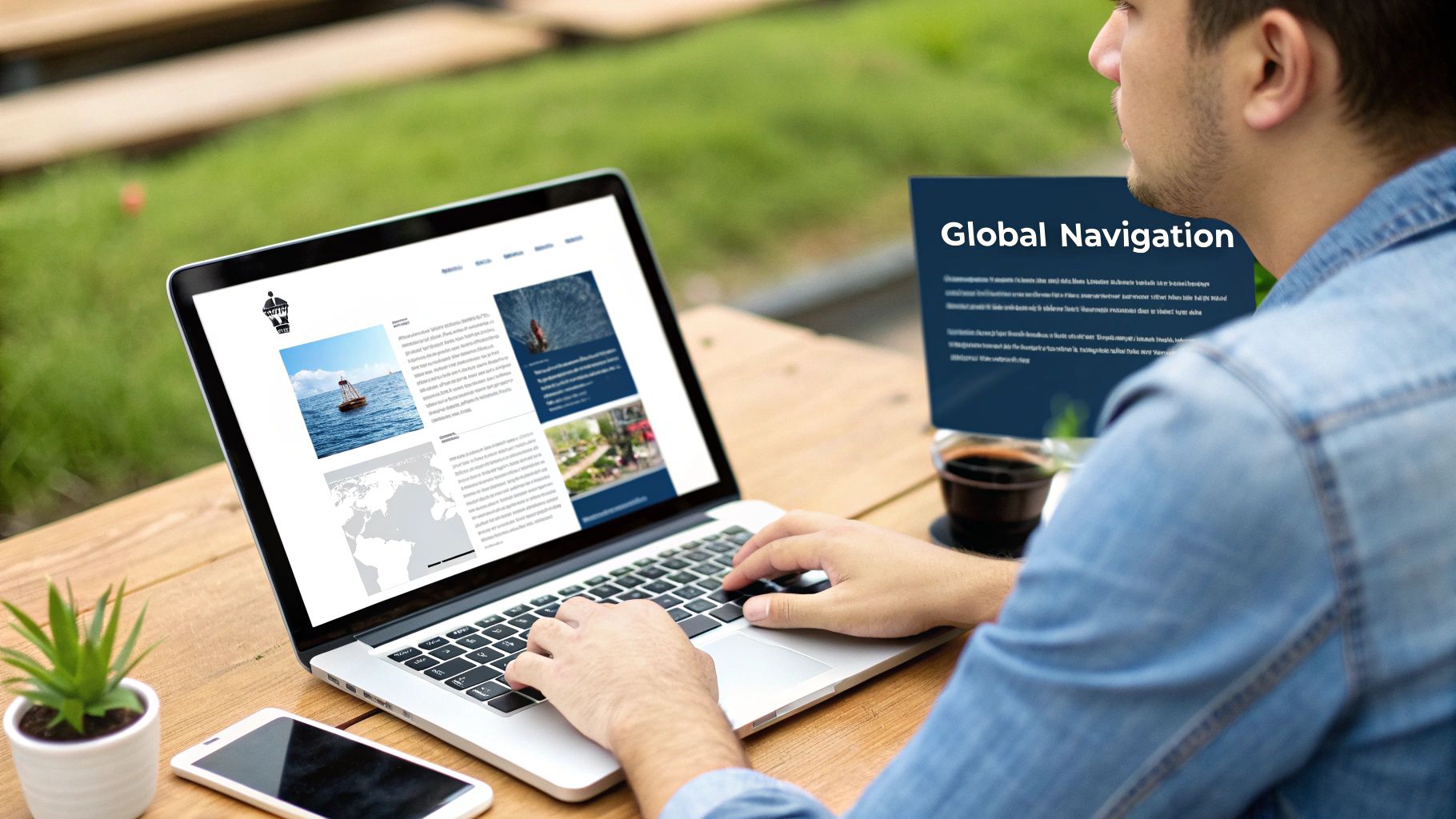
For a restaurant equipment supplier, this menu might include top-level categories like "Cooking Equipment," "Refrigeration," "Warewashing," and "Contact Us." As usability pioneer Steve Krug advises in Don't Make Me Think, navigation should be self-evident. A user should instantly understand what to expect from clicking a link. For example, a restaurant owner looking for a new commercial oven should be able to find it in seconds, not after several confusing clicks.
Why It's a Top Best Practice
Consistency breeds familiarity. When your navigation bar remains unchanged from your homepage to your product pages, users feel a sense of control and orientation. This is crucial for keeping potential customers engaged, especially on complex sites with extensive product catalogs. Poor navigation leads to frustration and high bounce rates, directly impacting your bottom line.
Actionable Implementation Tips
To create effective global navigation, follow these steps:
- Use Clear Labels: Avoid jargon. Use terms your customers use, like "Walk-In Coolers" instead of "Modular Cold Rooms." Test labels with actual users to ensure they are universally understood.
- Logical Grouping: Conduct card sorting exercises to understand how users mentally group your products. This data-driven approach ensures your categories are intuitive.
- Visual Hierarchy: Make top-level categories stand out with font weight or size. Subtly differentiate active pages to show users their current location within the site structure.
- Accessibility First: Ensure your menu is fully keyboard-navigable and uses semantic HTML with appropriate ARIA labels for screen reader compatibility.
For websites with extensive inventories, such as those detailing dozens of equipment categories, a simple navigation bar may not be enough. In these cases, enhancing your global menu is key. For content-rich websites, exploring a complete guide to better navigation with mega menus can provide the structure needed to display numerous options without overwhelming the user.
2. Descriptive and Actionable Link Text
Link text is the clickable text in a hyperlink. Using clear, descriptive labels for these links is a critical, yet often overlooked, best practice for site navigation. Instead of vague phrases like "Click Here," descriptive text tells users exactly what to expect on the destination page. This simple change enhances usability, improves accessibility for users with screen readers, and boosts SEO by providing valuable context to search engine crawlers.

For a restaurant equipment supplier, this means changing a link from "Learn More" to "Compare Commercial Freezer Models" or "Download Our Full Catalog." The latter gives a chef or manager a clear understanding of the action and its outcome. As research from usability experts at the Nielsen Norman Group shows, users scan pages for relevant keywords. Descriptive links act as powerful information signposts, helping them find what they need faster.
Why It's a Top Best Practice
Ambiguous link text forces users to guess, increasing cognitive load and frustration. When link text is descriptive, it builds trust and streamlines the user journey. For example, a link that says "View Financing Options" is far more compelling and helpful than a generic button. This clarity is especially vital for accessibility, as screen reader users often navigate by tabbing through links; descriptive text provides the necessary context they need to understand the page structure.
Actionable Implementation Tips
To write effective link text that serves both users and search engines, follow these guidelines:
- Avoid Generic Phrases: Completely eliminate "Click Here," "Read More," and "Learn More" from your navigation and body content. Always describe the destination.
- Use Action-Oriented Verbs: Start links with verbs when prompting an action. Use terms like "Request a Quote," "Schedule a Consultation," or "Subscribe to Our Newsletter."
- Be Specific and Concise: The link text should make sense on its own, without surrounding context. Instead of "Find out more about our content services," use "Explore Our Restaurant Blog Posting Services."
- Include Relevant Keywords: Naturally weave in keywords to improve SEO. A link to a page about ice machines should include the phrase "commercial ice machines" to help search engines understand the page's content.
This principle is a core component of the Web Content Accessibility Guidelines (WCAG) and is championed by usability experts like Jared Spool. By making this small but significant change, you can create a more intuitive, accessible, and search-friendly website, directly impacting user engagement and conversions.
3. Breadcrumb Navigation
Breadcrumb navigation is a secondary navigation aid that shows users their current location within a website's hierarchy. Inspired by the fairy tale "Hansel and Gretel," breadcrumbs leave a clear trail, allowing users to see their path from the homepage to the page they are on. This is especially crucial for websites with deep and complex structures, like a restaurant equipment supplier with thousands of products nested in various categories. This element is one of the top best practices for site navigation because it drastically improves user orientation and reduces the number of clicks needed to go back to a higher-level page.
For a restaurant supply website, a breadcrumb trail might look like this: Home > Commercial Ovens > Convection Ovens > [Specific Oven Model]. This instantly tells a busy chef or restaurant manager exactly where they are, allowing them to easily navigate back to the general "Commercial Ovens" category if the specific model isn't right. E-commerce giants like Amazon and Best Buy have perfected this, making it an expected feature for users browsing extensive inventories.
Why It's a Top Best Practice
Breadcrumbs significantly reduce user frustration and bounce rates. They provide context and give users a sense of place, which is vital for sites with multiple layers of content. Instead of repeatedly using the "back" button or starting their search over, users can simply click on a link in the breadcrumb trail to explore a broader category. This improved user experience directly supports SEO by encouraging longer session durations and more page views.
Actionable Implementation Tips
To effectively implement breadcrumb navigation, follow these key steps:
- Place Them Prominently: Position breadcrumbs at the top of the page, directly below the main global navigation, where users expect to find them.
- Reflect Site Hierarchy: Ensure the trail shows the page’s location within the site structure, not the user's click history. The path should always be logical and consistent.
-
Use Schema Markup: Implement
BreadcrumbListschema.org markup. This helps search engines understand your site structure and can result in breadcrumb rich snippets appearing in search results, improving click-through rates. - Keep Separators Simple: Use a simple, non-intrusive character like a greater-than sign (>) or a slash (/) to separate the links. The final item, representing the current page, should not be a link.
There are several ways to structure breadcrumbs, each serving a different purpose. The following diagram illustrates the three primary types of breadcrumb navigation.
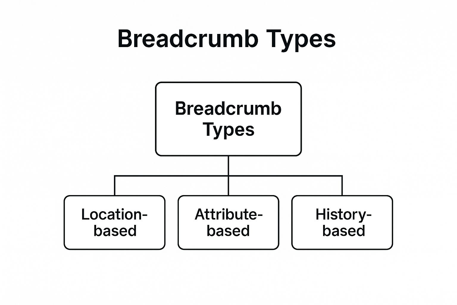
This hierarchy shows that while all are "breadcrumb types," location-based is the most common and recommended for establishing a clear structural path, which is fundamental to strong site usability and SEO.
4. Mobile-First Responsive Navigation
Mobile-first responsive navigation is a design strategy that prioritizes the user experience on mobile devices before scaling up for tablets and desktops. Instead of creating a complex desktop menu and trying to shrink it, you start with the most constrained environment. This approach is essential because a significant portion of your traffic, from restaurant owners browsing on their phones to chefs checking specs in the kitchen, comes from mobile devices. This is a core element of best practices for site navigation as it directly addresses modern user behavior.
This methodology forces you to focus on the most critical navigation elements first, ensuring a clean and efficient experience. As Luke Wroblewski, who coined the "Mobile First" philosophy, highlighted, designing for mobile constraints leads to a more focused and user-centric final product across all platforms. For instance, a restaurant equipment supplier might use a bottom navigation bar on mobile for "Shop," "Account," and "Support," which then expands into a full header menu on desktop.
Why It's a Top Best Practice
With Google's mobile-first indexing, a site's mobile version is the baseline for how search engines determine rankings. A poor mobile navigation experience doesn't just frustrate users; it directly harms your SEO and visibility. For a business in the competitive restaurant supply industry, ensuring potential buyers can easily find products like commercial freezers or induction cooktops on any device is critical for capturing leads and driving sales.
Actionable Implementation Tips
To implement effective mobile-first navigation, consider these steps:
- Prioritize Thumb-Zone Actions: Place your most important navigation links, like "Categories" or "Cart," within the natural thumb-reach area at the bottom of the screen.
- Use Labeled Icons: Avoid ambiguity. An icon for "Cooking Equipment" is clearer when paired with the text label, reducing user guesswork and improving accessibility.
- Ensure Large Touch Targets: Make all navigation links and buttons at least 44x44 pixels. This prevents frustrating "fat-finger" errors for users on the go.
- Test on Real Devices: Browser emulators are helpful, but nothing beats testing your navigation on actual smartphones and tablets to identify real-world usability issues.
For a restaurant equipment supplier with a vast inventory, a simple hamburger menu might hide crucial categories. Instead, consider a "priority+" pattern, which displays top-level categories like "Refrigeration" and "Cooking" while tucking secondary links like "Blog" or "About Us" into a "More" menu. This keeps vital product pathways visible while maintaining a clean interface.
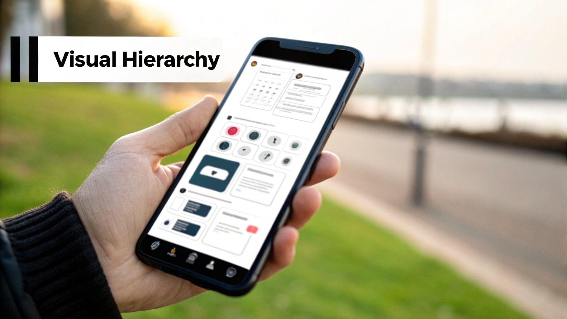
5. Visual Hierarchy and Information Architecture
Visual hierarchy in navigation is the strategic arrangement and styling of menu elements to guide a user's attention. It blends information architecture, the organization of your content, with visual design principles like size, color, and spacing. This creates a clear path, helping users instantly understand the relative importance of navigation options and the relationships between them. This is one of the most critical best practices for site navigation because it makes complex information scannable and intuitive.
For a restaurant equipment supplier, this means making primary categories like "Commercial Ovens" and "Refrigeration" more prominent than secondary links like "Blog" or "About Us." Think of how Stripe’s documentation uses bold primary topics with indented sub-topics; this structure immediately clarifies the content's organization. A well-executed visual hierarchy prevents users from feeling overwhelmed and helps them find specific equipment, like a high-capacity ice machine, without confusion.
Why It's a Top Best Practice
A strong visual hierarchy acts as a silent guide, directing users to the most important parts of your website first. It reduces cognitive friction by presenting information in a predictable, organized format, which is essential for sites with large inventories or diverse services like SEO and blogger outreach for industry clients. When users can effortlessly distinguish primary from tertiary actions, they are more likely to stay on the site, explore deeper, and ultimately convert.
Actionable Implementation Tips
To effectively implement visual hierarchy and information architecture, follow these steps:
- Limit Primary Items: Adhere to Miller's Law by keeping your main navigation to 5-7 key items. This prevents decision paralysis for busy restaurant owners.
- Use Visual Weight: Make primary categories larger, bolder, or use a contrasting color to draw the eye. Position them at the top or far left, following natural F-pattern reading behavior.
- Group Related Items: Apply the principle of proximity by using whitespace to visually group related sub-menu items, such as different types of "Cooking Equipment."
- Conduct Tree Testing: Before finalizing the design, validate your information architecture. Tree testing helps confirm that your categories make logical sense to your target audience.
Properly structuring your navigation is fundamental to user experience. To master guiding user attention through your navigation, delve deeper into the principles of Visual Hierarchy in Web Design.
6. Search Functionality Integration
Integrating robust search functionality offers a direct path for users to find precisely what they need, bypassing traditional menu browsing. For large sites, like a restaurant equipment supplier with thousands of SKUs, a powerful search bar isn't a luxury; it's a necessity. It acts as an express lane for users with high purchase intent, providing a quick, efficient alternative to navigating complex category structures. This is a critical component of best practices for site navigation because it caters to goal-oriented users who already know what they're looking for.
Think of Amazon's search bar. It doesn't just find products; it suggests categories, offers filters, and handles misspellings, making the discovery process seamless. A restaurant manager searching for a "2-door reach-in freezer" wants immediate, relevant results, not a journey through "Refrigeration > Freezers > Reach-In Models." As information architecture expert Peter Morville championed, search is a primary form of navigation, and its quality directly influences user satisfaction and conversion rates.
Why It's a Top Best Practice
A well-implemented search function significantly reduces friction and shortens the customer journey. It empowers users, giving them control to find specific items or information quickly. For businesses, the data gathered from search queries is invaluable, revealing customer intent, popular products, and content gaps. Analyzing failed searches helps identify missing inventory or opportunities for new article writing, turning user frustration into actionable business intelligence.
Actionable Implementation Tips
To integrate effective search functionality, focus on the user experience:
- Prominent Placement: Position the search bar in the top-right header, a convention users expect. Ensure it’s wide enough to display typical queries (at least 27 characters).
- Implement Autocomplete: Provide real-time suggestions as users type. This speeds up the process, reduces spelling errors, and guides users toward available products.
- Faceted Search Results: Allow users to filter results by attributes like brand, price, capacity, or voltage. This is essential for large catalogs of restaurant equipment.
- Handle "No Results": Create a helpful "no results" page that offers alternative suggestions, links to popular categories, or contact information instead of a dead end. Use analytics to track these queries to inform your SEO and content strategy.
7. Clear Visual Feedback and Active States
Visual feedback is the immediate response a website provides when a user interacts with a navigation element. It confirms their actions and shows their current location, acting like a digital "you are here" sign. This includes hover effects when a mouse moves over a link, active states showing the current page, and focus indicators for keyboard navigation. This practice is a cornerstone of effective site navigation because it provides clarity, reduces user uncertainty, and fosters a sense of control.
Imagine a restaurant owner browsing for a new convection oven. When they click on "Cooking Equipment," that link should change appearance, maybe becoming bold or underlined. As they hover over sub-categories like "Ovens" or "Fryers," those links should also react. These small visual cues, championed by usability expert Jakob Nielsen as "visibility of system status," assure the user that the system is responding to their inputs, making the navigation process intuitive rather than confusing.
Why It's a Top Best Practice
Effective visual feedback builds user confidence and enhances orientation. When users know where they are and see their actions acknowledged, they feel empowered to explore deeper. For a restaurant equipment supplier with hundreds of products, this clarity prevents users from feeling lost. It directly reduces bounce rates by making the site feel responsive and professionally built, which is a key component of a successful digital marketing strategy.
Actionable Implementation Tips
To implement clear visual feedback, focus on distinct states:
- Define Interaction States: Create unique, yet consistent, styles for default, hover, focus, and active navigation links. Use multiple cues like color, font weight, and underlines to support all users.
-
Prioritize Accessibility: Ensure focus indicators for keyboard users are highly visible and meet WCAG 2.1 contrast requirements. Use the
:focus-visiblepseudo-class to show focus outlines only when needed. - Use Subtle Transitions: Apply smooth CSS transitions (around 200-300ms) to state changes. This makes the interaction feel polished and modern without causing jarring visual shifts.
- Test Thoroughly: Manually navigate your site using only a keyboard to ensure every interactive element provides clear feedback. Verify that active states are persistent and correctly indicate the user's location.
For businesses looking to enhance their site's usability, mastering visual feedback is crucial. It’s a detail that, when combined with strong SEO and professional article writing, transforms a simple product catalog into a powerful sales tool.
8. Footer Navigation for Secondary Content
Footer navigation acts as a comprehensive sitemap and safety net at the bottom of every page. It provides users with organized access to important but secondary content that doesn't fit in the primary header navigation. This includes legal information, company details, customer service links, and other resources. For a user who has scrolled to the bottom of a page, a well-structured footer offers a clear next step, preventing a dead end and improving their overall experience. This is one of the most crucial best practices for site navigation because it supports both user journey completion and SEO.
Consider a restaurant equipment supplier's website. The footer is the ideal place for links like "About Us," "Careers," "Shipping Policy," "Terms of Service," and "Privacy Policy." While a chef looking for a convection oven doesn't need these links in the main menu, they are essential for building trust and providing complete information. Major brands like Nike and Spotify exemplify this by organizing their footers into clean, scannable columns such as "Get Help," "About Nike," and "Useful Links," making secondary information easy to find.
Why It's a Top Best Practice
The footer serves two key functions: user assistance and SEO enhancement. For users who don't find what they need in the primary navigation, the footer provides a second chance to navigate the site. For search engines, the footer creates a rich network of internal links on every page, helping crawlers understand your site's structure and distributing link equity to important pages. This improves discoverability and can positively impact your rankings.
Actionable Implementation Tips
To design an effective and organized footer, follow these steps:
- Organize into Columns: Group related links into 3-5 distinct categories with clear headings like "Products," "Support," or "Our Company." This makes the information scannable.
- Prioritize Important Links: Place the most critical secondary links, such as "Contact Us" or "Request a Quote," in the top-left section, as users tend to scan in that direction.
- Include a Call-to-Action: Add a newsletter signup form. A user who reaches the footer is often highly engaged and more likely to subscribe for updates or promotions.
- Add Legal and Trust Signals: Always include links to your "Privacy Policy" and "Terms of Service." For restaurant equipment suppliers, adding links to financing options or warranty information can also build credibility.
A well-designed footer is an often-underestimated component of strong site navigation. For a restaurant supplier, this is also a prime location to link to valuable resources like buying guides or blog posts. Leveraging services that specialize in SEO and blog writing for restaurant suppliers can help create high-quality content that you can feature in your footer, turning it into a powerful tool for user engagement and lead generation.
Best Practices Site Navigation Comparison
| Navigation Practice | Implementation Complexity 🔄 | Resource Requirements ⚡ | Expected Outcomes 📊 | Ideal Use Cases 💡 | Key Advantages ⭐ |
|---|---|---|---|---|---|
| Clear and Consistent Global Navigation | Medium - requires IA planning | Moderate - design + dev effort | Improved orientation, lower bounce rates | Sites needing strong brand consistency, broad scope | Reduces confusion, supports mental models |
| Descriptive and Actionable Link Text | Low - primarily content editing | Low - copywriting focus | Better accessibility, SEO, and CTR | Sites with many links needing clarity | Enhances usability, keyword rich link texts |
| Breadcrumb Navigation | Low to Medium - minor dev | Low - design + dev for accuracy | Better hierarchy understanding, fewer clicks | Sites with deep hierarchies or complex content | Saves clicks, improves SEO, minimal space |
| Mobile-First Responsive Navigation | High - responsive design required | High - responsive dev and testing | Usability across devices, improved mobile UX | Mobile-heavy traffic sites, multi-device environments | Prioritizes important items, future-proofing |
| Visual Hierarchy and Information Architecture | Medium - design intensive | Moderate - design + dev effort | Reduced cognitive load, better scanning | Complex menus needing clear structure | Guides attention, improves accessibility |
| Search Functionality Integration | High - search engine setup needed | High - complex dev + maintenance | Fast content access, enhanced user intent data | Large sites with extensive content | Provides alternative navigation, powerful UX |
| Clear Visual Feedback and Active States | Medium - css/js for states | Moderate - design + dev | Higher confidence, lower errors | All sites requiring interactive navigation | Reduces errors, supports accessibility |
| Footer Navigation for Secondary Content | Low - mainly content organization | Low to Moderate - design + upkeep | Extra navigation options, better SEO | Sites with extensive secondary/legal/social links | SEO benefits, secondary access, expected UX |
Building a Navigational Roadmap to Success
Navigating the digital landscape successfully requires more than just a collection of webpages; it demands a thoughtfully constructed, intuitive pathway that guides users effortlessly toward their goals. Throughout this article, we've explored the foundational pillars of effective site navigation, from establishing a clear and consistent global navigation to leveraging the often-underutilized power of a well-organized footer menu. Each practice serves a distinct purpose, yet they all converge on a single, crucial objective: to enhance the user experience and drive conversions.
Mastering these best practices for site navigation is not merely a design exercise. It is a strategic imperative for any business in the competitive restaurant equipment supply industry. When a busy chef or a new restaurant owner lands on your site, they need to find information about commercial ranges or refrigeration units without friction. A logical visual hierarchy, descriptive link text, and helpful breadcrumbs are the signposts that build trust and prevent user frustration, keeping them engaged with your content and products.
From Theory to Tangible Results
The true value of superior navigation lies in its direct impact on your business objectives. A well-integrated search function can dramatically reduce bounce rates by connecting users with the exact equipment they need in seconds. Similarly, designing with a mobile-first responsive approach ensures you cater to professionals browsing on tablets in the kitchen or phones on the go. These aren't just technical details; they are critical touchpoints that can mean the difference between a lost visitor and a loyal customer.
Ultimately, a robust navigational structure amplifies all your other marketing efforts. Your expertly written blog posts, local SEO campaigns, and detailed product descriptions are only effective if users can find them. Think of your navigation as the central nervous system of your digital presence, connecting every piece of content and every product into a cohesive, user-centric journey. By implementing these best practices for site navigation, you're not just organizing a website; you are building a powerful, conversion-focused platform that supports your customers and grows your business.
Ready to see these principles in action on a site built for the restaurant industry? Explore Charbroilers.com, where intuitive navigation helps you seamlessly compare top-tier equipment. Notice how clear categories and a user-friendly layout make finding the perfect charbroiler for your professional kitchen a simple and efficient process.